Meta has made some big changes to WhatsApp to make it look and feel better. These updates are the biggest changes since last year.
They wanted WhatsApp to feel new, easy to use, and simple. So they focused on three main ideas:
– Making it feel fresh: They wanted WhatsApp to look new and match your phone.
– Making it easy to use: They wanted WhatsApp to be simple and friendly for everyone.
– Keeping it simple: They wanted the design to be straightforward and ready for the future.
Here’s what they did:
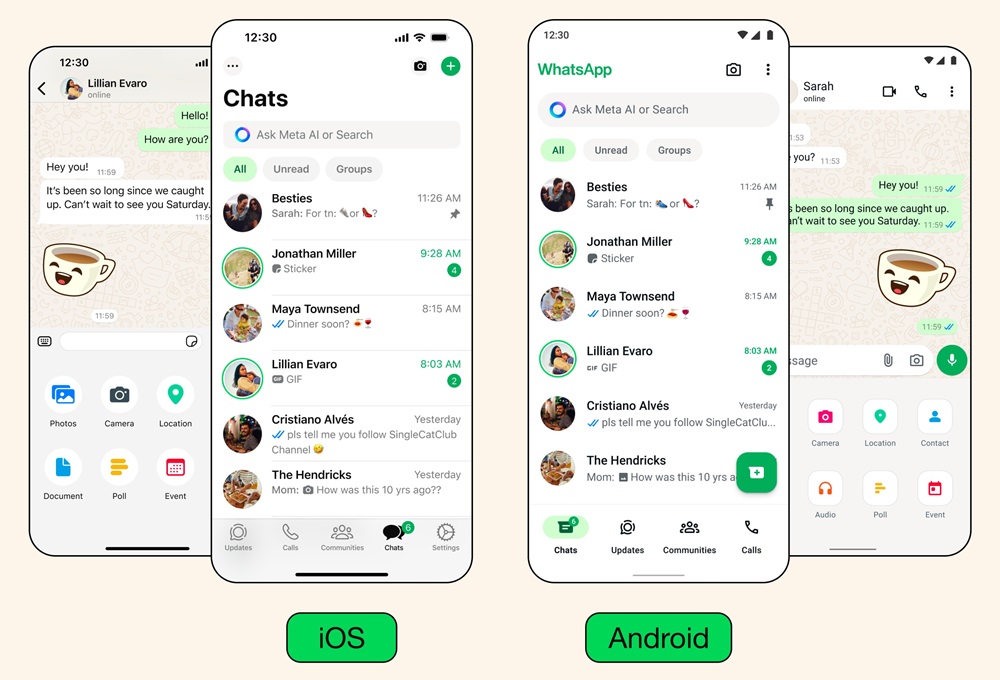
– New Colors: WhatsApp now has a new green look that matches well with other colors. They also added some neutral colors to make it more flexible. And they made a darker mode for using WhatsApp in the dark without straining your eyes.
– Updated Icons and Pictures: They changed the icons to look rounder and outlined. They also updated the pictures and made them more fun with animations. The backgrounds for chats also got simpler and show more diversity.
– Easier to Navigate: If you have an Android phone, you’ll see a new bar at the bottom of WhatsApp. It makes it easier to find things quickly. The tabs are closer to your thumb so you can move around easier. And soon, iPhone users will get a new layout for sending things like pictures and documents.
– Better Chat Management: They added filters to help you find important chats faster. On Android, the filters are at the top of your chats list. You can switch between unread messages and group chats easily.
Meta remains committed to enhancing connectivity through WhatsApp, whether it’s for personal communication, business interactions, or leveraging Meta AI for various tasks, and are dedicated to introducing new features and improvements to empower users.