What do we have here – a new revamped twitter interface with simplicity that allows users to explore trends the easiest way.
You can easily switch account on desktop just like we have on mobile that doesn’t require a user login and out. In other words, if you have multiple accounts, you can easily switch profiles quickly without having to log in and log out. Direct Message and conversation are now located on same window.
The biggest, most noticeable change is that the top navigation bar has been moved to the left sidebar, which contains bookmarks, lists, your profile, and a new explore tab.
Twitter says the explore tab has been brought over from its mobile app to feature more live videos and personalized local trends.
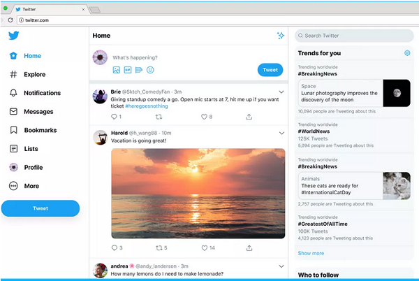
This is more like borrowing more features from twitter mobile to improve desktop users experience.
Finally, The company is bringing in a dark theme, which is indeed black, unlike the current ‘navy blue-tinged color’ on desktop. This means there will be two color variants to choose from for Twitter’s dark UI.
The new UI has been revealed yesterday night and will be available for all users in a few days to come.
Nice one
Good update. Pour les utilisateurs
the update is cool
I can’t even remember password again 😳😱😭🙄
This looks cool
Been long I checked on Twitter